ECI Cognytics Features and Functionality
When your company installs and enables ECI Cognytics (which ECI does for you if ECI is hosting your site in the cloud), your e-automate toolbar lists a [Dashboards] button in place of the [Metrics] button. When you use this button to access an ECI Cognytics dashboard to which you have view rights, the system displays key metrics data in dashboard format. The following table provides information on each of the view types used in the dashboards.
|
Dashboard Components |
||
|
View Type |
Example |
Description |
|
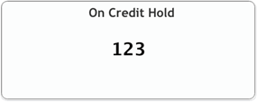
High-level Total |
|
Identifies a key metric (e.g., On Credit Hold), and displays the metric's value (e.g., 123). |
|
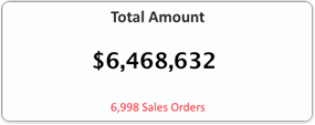
High-level Total Set |
|
Identifies a key metric (e.g., Total Amount) and displays the metric's value (e.g., $6,468,632). |
|
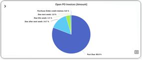
Pie Chart with List View Option |
|
Identifies a key metric (Open PO Invoices (Amount)), and displays a pie chart containing labeled slices that identify components of the metric (e.g., Purchase Order Credit Memos, Due This Week, Due Next Week, Due After Next Week, Past Due) and a value representing each slice's proportion of the whole (e.g., 0.0%, 3.5%, 1.0%, 14.7%, and 80.8%, respectively). |
|
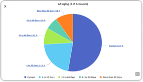
Pie Chart with Drill Down and List View Option |
|
Identifies a key metric (AR Aging (# of Accounts)), and displays a pie chart containing labeled slices that identify components of the metric (e.g., Current, 1 to 30 Days, 31 to 60 Days, 61 to 90 Days, More than 90 Days) and a value representing each slice's proportion of the whole (e.g., 52.7%, 21.3%, 9.2%, 6.9%, and 9.8%, respectively). |
|
Line Chart with List View Option |
|
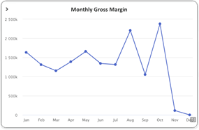
Identifies a key metric (Monthly Gross Margin), and displays a line chart showing the metric's values plotted over a period of time (e.g., total monthly gross margin amount plotted for each month of a twelve-month period). Includes a Click to Show List View icon in the lower right corner. Clicking the icon displays a grid/table view of the data on which the line chart is based. |
|
Bar Graph with List View Option |
|
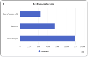
Identifies a key metric group (Key Business Metrics), and displays a bar graph plotting the value of each metric in the group (e.g., plotting the monetary amounts of Cost of Goods Sold, Revenue, and Gross Margin). Includes a Click to Show List View icon in the lower right corner. Clicking the icon displays a grid/table view of the data on which the bar graph is based. |
|
Stacked Bar Graph |
|
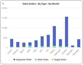
Identifies a key metric group (Sales Orders - By Type - By Month), and displays a stacked bar graph plotting the value of each metric in the group (e.g., plotting the monetary amounts of Equipment Orders, Other Orders, and Supply Orders) over a period of time (e.g., total monthly monetary amount for each order type plotted for each month of a twelve-month period). If you click a color-coded item in the key below the graph, the system will change the item's color to gray, exclude all bars of that color from the graph, and adjust the graph of the remaining bars accordingly. Similarly, if you click an item shown in gray in the key below the graph, the system will re-display the item's color, include all bars of that color in the graph, and adjust the graph of the remaining bars accordingly. |
|
List View with Chart View Option |
|
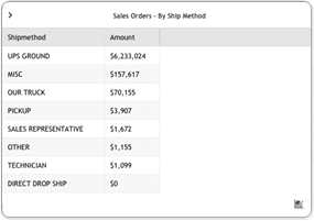
When you click the Click to Show List View icon in the lower right corner of pie chart, line chart, or bar graph, displays the data on which the chart or graph is based (e.g., when you click the Click to Show List View icon on the Sales Orders - By Ship Method pie chart, the List View displays a Sales Orders - By Ship Method grid/table that lists the Ship Method and Amount for each slice of the pie chart). |
|
List View |
|
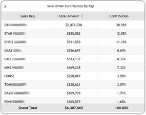
Displays in table format data applicable to the selected dashboard (e.g., for the Sales Orders Dashboard, the Sales Order Contribution By Rep table, which lists Sales Rep, Total Amount, and Contribution for each sales rep). Note: Single-clicking a column header toggles between ascending and descending sorts of table data based on the selected column. An arrow to the right of the column name indicates if the current sort is ascending (up arrow) or descending (down arrow).
|
From each view type, you can access a series of menu options. The following table provides information on the options associated with the menu.
|
View Menu Icons |
||
|
Icon |
Name |
Function |
|
|
Expand Menu |
Click to display the view's menu options. Note: This icon is not visible by default. To display the icon, position the cursor in the top left corner of the view for which you want to display the view's menu.
|
|
|
Collapse Menu |
Click to hide the view's menu options. |
|
|
Maximize to Window |
Click to expand the view to fill the size of the dashboard window. |
|
|
Restore |
Click to restore the view to its original size within the dashboard window. |
|
|
Maximize to Fullscreen |
Click to expand the view to fill the monitor. |
|
|
Restore |
Click to restore the dashboard window to its original size and to restore the view to its original size within the dashboard window. |
|
|
Refresh |
Click to refresh the view. Note: Refreshing the view does not refresh the data on which the view is based. To conserve system resources, dashboard data is updated nightly.
|
|
|
Export |
Click to export the view's data. Note: When you click this option, the system displays a menu listing the export options available for the selected view's data. These options may include:
Download PNG Image Download JPEG Image Download PDF Document (containing an image of the view) Download SVG Vector Image Export to Excel Note: This option is only available for list views and will only be available in the standard version of ECI Cognytics for a limited time. After that time, this option will only be available in the premium version of ECI Cognytics.
|
|
|
Info |
Click to display the following data associated with the selected view: Widget Name Widget Description Filters Dimensions Measures Date |


From certain views, you can access additional icons. The following table provides information on these additional icons.
|
Additional View Icons |
||
|
Icon |
Name |
Function |
|
|
Click to Show List View (Flip Grid) |
Click to display in grid/table format the data on which the selected view (pie chart, line chart, bar graph) is based. Note: This icon is not visible by default. To display the icon, position the cursor in the lower right corner of the view for which you want to see the view's data in list view.
Note: Acsellerate refers to this functionality as "flip grid" functionality because you can click the icon to flip the chart view to the list view and vice-versa.
|
|
|
Click to Show Chart View (Flip Grid) |
Click to re-display the chart/graph associated with the view's list view. Note: This icon is not visible by default. To display the icon, position the cursor in the lower right corner of the view for which you want to see the view's data in chart/graph view.
Note: Acsellerate refers to this functionality as "flip grid" functionality because you can click the icon to flip the list view to the chart view and vice-versa.
|
|
|
Restore |
Click to re-display the chart/graph associated with the view's list view. Note: This icon is visible by default in the view's top right corner when the list contains enough records to require a scroll bar that would block the location of the Click to Show Chart View icon.
|
|
|
Ascending Sort |
Displays to the right of a list view column when the list's data is sorted in ascending order by that column. Click to toggle to descending sort. |
|
|
Descending Sort |
Displays to the right of a list view column when the list's data is sorted in descending order by that column. Click to toggle to ascending sort. |


Non-supported ReleaseNon-supported Release
©2024 ECI and the ECI logo are registered trademarks of ECI Software Solutions, Inc. All rights reserved.